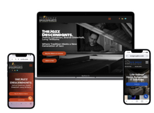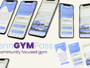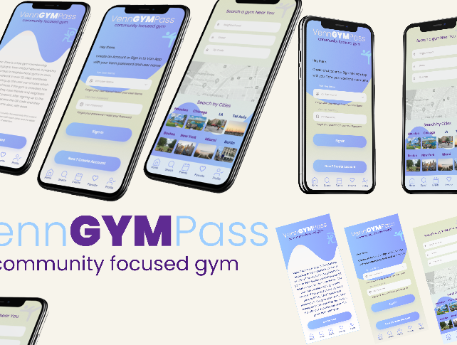
People visit business websites from phones, tablets, laptops, and desktop computers. Your website needs to provide a clear experience on all of them.
Professional responsive website design New York focuses on creating websites that adjust to different screen sizes without losing important information or functionality.
A responsive website is more than a smaller desktop website. Menus, buttons, images, forms, text, and page sections all need to work properly across different devices.
For New York businesses, this matters because potential customers often search for services while they are away from their computers. If your website is difficult to use on a phone, visitors might leave before learning about your business.
What Is Responsive Website Design New York?
Responsive website design means creating a website that adjusts to the screen being used.
On a desktop, visitors might see a wide navigation menu and multiple content sections side by side.
On a smartphone, the same page needs to reorganize itself into a smaller layout.
Responsive design usually considers:
- Screen size
- Navigation
- Images
- Text
- Buttons
- Forms
- Page spacing
- Content sections
The purpose is simple. Visitors should be able to use the website without constantly zooming or scrolling sideways.
Why Does Web Design New York Need to Be Mobile Friendly?
A website is often the first place customers research a business.
Professional Web design New York should therefore consider how the website works on smartphones as well as larger screens.
A mobile visitor should be able to:
- Open the menu
- Read service information
- View images
- Click buttons
- Submit forms
- Find contact details
A responsive layout makes these actions easier.
How Can a Website Designer New York Create a Better Mobile Experience?
A professional website designer New York considers mobile layouts during the design process rather than treating mobile as an afterthought.
The designer can plan how sections will rearrange on smaller screens.
For example, three service boxes displayed side by side on a desktop might appear one below another on a smartphone.
Images might also need different sizes to prevent unnecessary loading.
Why Is a Graphic Design Studio NYC Useful for Responsive Websites?
Images and graphics need to work across different screen sizes.
A graphic design studio NYC can create visual assets that fit your website while keeping the brand consistent.
Graphics should be prepared with different screen sizes in mind.
Large images that look good on a desktop can become slow or difficult to display on mobile devices if they are not properly optimized.
How Does WordPress Web Design New York Support Responsive Websites?
WordPress provides many options for building responsive websites.
Professional WordPress web design New York can create layouts that adapt to different devices.
However, simply using WordPress does not automatically make every website perfect on mobile.
Themes, plugins, images, custom sections, and code still need to be tested.
A responsive WordPress website should be reviewed on different screen sizes before launch.
When Should You Hire a WordPress Developer NYC for Responsive Issues?
Some mobile problems require technical work.
A WordPress developer NYC can help fix issues involving themes, plugins, custom code, forms, menus, and page layouts.
Development support is useful when:
- Mobile menus do not work
- Content overflows the screen
- Forms are difficult to use
- Custom sections break on phones
- Images display incorrectly
- Plugins cause layout problems
Technical fixes should be tested after implementation.
Why Does Branding and Logo Design New York Matter on Mobile Websites?
Your brand should remain recognizable regardless of the device.
Professional branding and logo design New York creates visual elements that can work across websites and marketing channels.
A responsive website should preserve:
- Logo visibility
- Brand colors
- Typography
- Visual style
- Graphic elements
The logo might need to appear smaller on a phone, but it should still remain clear and recognizable.
How Can Small Business Web Design New York Benefit From Responsive Design?
Small businesses often depend on local customers searching for services from their phones.
Professional small business web design New York should make important information easy to access on smaller screens.
A customer should quickly find:
- Services
- Location
- Business information
- Reviews
- Contact details
- Request forms
Responsive design helps reduce unnecessary steps.
Why Is Responsive Design Important for Contractor Web Design New York?
Contractors often use project photos to demonstrate their work.
Professional contractor web design New York needs to display these images properly across different devices.
A mobile visitor should be able to browse projects without dealing with oversized images, broken galleries, or difficult navigation.
Project pages should also include clear information about the work and an easy way to contact the contractor.
How Can a Graphic Designer New York Support Responsive Website Content?
A graphic designer New York can create graphics that work with responsive layouts.
This includes:
- Website banners
- Promotional graphics
- Icons
- Social media images
- Marketing visuals
Graphics should be designed with the final display size in mind.
A graphic that looks good on a large desktop screen might need adjustments before being used on a phone.
When Is a Freelance Web Designer NYC a Good Option for Responsive Design?
A freelance web designer NYC can help with smaller website projects, redesigns, landing pages, and responsive improvements.
Before hiring a freelancer, ask how mobile testing will be handled.
A responsive project should include testing across different screen widths rather than checking only one smartphone.
How Can Custom Website Design New York Improve Responsive Experiences?
Custom design provides more control over how pages behave on different devices.
Professional custom website design New York can plan mobile layouts around your actual content and customer needs.
Custom responsive design can be useful for websites with:
- Large portfolios
- Complex service pages
- Custom forms
- Booking systems
- Project galleries
- Interactive features
The design should remain practical even when the website contains many elements.
What Should a Responsive Website Look Like on a Smartphone?
A mobile website should feel easy to use.
The navigation should be simple.
Text should be readable without zooming.
Buttons should have enough space around them.
Images should fit the screen.
Forms should be easy to complete.
Important information should not be hidden behind unnecessary design elements.
A visitor should be able to move from the homepage to a service page and then contact the business without frustration.
How Can Responsive Design Improve Website Navigation?
Navigation often needs to change on smaller screens.
A desktop website might display several menu items across the top.
On a phone, these items usually need to fit inside a mobile menu.
The important thing is not the exact menu style. It is whether visitors can find important pages quickly.
Service pages, contact information, about information, and other important sections should remain easy to access.
Why Should Forms Be Tested on Mobile Devices?
Forms are often used to generate leads.
A form that works perfectly on a desktop might be difficult to complete on a smartphone.
Check:
- Field sizes
- Text visibility
- Dropdown menus
- Required fields
- Submit buttons
- Confirmation messages
Test the complete submission process.
Do not assume the form works because the page itself loads correctly.
How Can Responsive Design Affect Website Speed?
Responsive design and website performance are connected.
Large images, unnecessary scripts, and poorly configured plugins can make mobile pages slower.
A responsive website should use appropriately sized images and efficient page elements.
Performance should be checked on both desktop and mobile devices.
A fast website gives visitors a better experience.
Why Should Responsive Design Be Considered During a Website Redesign?
A redesign is a good opportunity to fix mobile problems.
If the existing website has outdated layouts, difficult navigation, or poor mobile performance, these issues should be addressed during the planning stage.
Do not design the desktop version first and leave mobile adjustments until the end.
Mobile requirements should be part of the initial design process.
How Can Responsive Website Design New York Support SEO?
A mobile-friendly website supports a better overall user experience.
SEO also depends on clear content structure, useful pages, internal links, and technical website quality.
Responsive design helps ensure visitors can access the same important content across different devices.
Your mobile visitors should not receive a stripped-down experience where important information is missing.
What Should You Test Before Launching a Responsive Website?
Before launch, review the website at several screen sizes.
Check:
- Homepage
- Navigation
- Service pages
- Contact forms
- Images
- Buttons
- Tables
- Videos
- Portfolio galleries
- Footer links
Also test landscape and portrait orientations on mobile devices.
Small layout problems are easier to fix before the website receives regular visitors.
How Can Responsive Website Design New York Help Local Businesses?
Local customers often search for businesses while they are away from their computers.
They might search for a service, compare companies, read reviews, and contact a business within a short period.
A responsive website makes this process easier.
Your website should give mobile visitors the information they need without unnecessary scrolling or difficult navigation.
What Should You Ask Before Hiring a Responsive Website Design New York Provider?
Ask how responsive design will be handled from the beginning.
Useful questions include:
- Will the website be designed for mobile first?
- Which devices will be tested?
- Will forms be tested on phones?
- How will images be optimized?
- Will mobile navigation be customized?
- Who handles technical fixes?
- Will the website be checked after launch?
Clear answers help you understand what is included.
How Can Responsive Website Design New York Support Long-Term Business Growth?
Your website will change as your business grows.
You may add new services, publish articles, create landing pages, add project galleries, or introduce new features.
Each new page should follow the responsive design system.
Professional responsive website design New York gives businesses a foundation for these future changes.
When responsive design works together with Web design New York, WordPress development, branding, graphic design, and SEO, your website becomes easier for customers to use across different devices.
The goal is simple. Your website should look professional, load properly, and remain easy to use whether someone visits from a phone, tablet, laptop, or desktop computer.